Creating a visual brand identity for your small business might feel like a huge undertaking. It can be overwhelming when you think of everything you have to consider, and how it’s all going to fit together cohesively.
If you search for ‘small business branding’ online, you may come across some articles that say if you don’t know who your target customer or client is, there’s no point even spending time on developing personal and unique branding. “Your brand is not about you, it’s about your customer” they repeat, over and over.
Here’s the thing though, I know from experience of working with many small businesses over the years that it’s a bit like a chicken and egg situation. What comes first? You need great visual branding in order to attract the right customers and clients, but how should that branding look and feel if you’re right at the beginning and you don’t yet know exactly who your customer or client is. Minefield or what?!
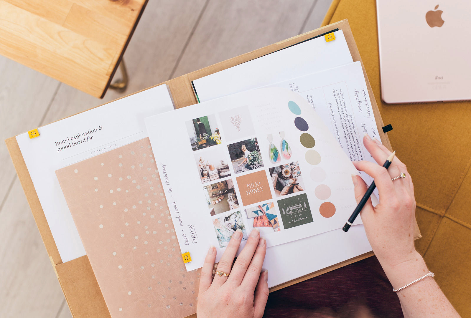 Whether you’re at the beginning stages of your business journey, or you’re looking to improve on what you already have, I want to talk you through four steps that will help you to approach this task in a manageable way and allow you creatively yet methodically, work out your small business brand identity design.
But first…
Buzz word buster: Your brand entails everything people see, hear, smell, feel, when they encounter your brand (of course depending on whether you’re an online or product based business). It’s both tangible and intangible. Your brand identity can include your logo and visual identity, but it’s also the way you write and talk about your business. Then, you can think of branding as a verb. The act of branding is where you’re working on creating and refining everything that makes up your brand identity. Here, we will focus mostly on the visual brand identity design…
 STEP 1 / How does it feel?
What I always suggest is to take a step back, zoom out, and simply think first about how you would like people to feel when they encounter your brand. The emotion really is at the heart of everything.
Related Post: Georgina Lee-Jones also talks beautifully about this in her article Brand Storytelling for Creative Businesses
Branding is truly about personality. We want to make a brand feel ‘alive’ so that people feel somewhat connected to it in the same way they might connect with a friend’s personality.
This quote from Maya Angelou rings so true to branding as well as for our personal lives “People will forget what you said, people will forget what you did, but people will never forget how you made them feel.”
Kimberly Duran from Swoon Worthy Scents explains how thinking in this way helped her with coming up her own branding: “I create products for which scent plays the biggest role so selling online can always be challenging. Instead, I try to highlight a feeling or a mood that the scent evokes in order to give people an idea of the way one of my products might make them feel.”
So, the first step is to write down words and phrases that come into your mind when you think about how you’d like your brand to feel. As many as you like. Don’t overthink it at this point.
STEP 2 / Refine, refine, refine
Next, refine your words and phrases by using a thesaurus or searching on Google for similar words. Sometimes you’ll pin-point a word that’s close, but it’s not quite right, so finding synonyms and comparing the feel of each of the words can help you find the right one.
For example, the words ‘natural’ and ‘organic’ have similar meanings, but they FEEL different, and would lead to slightly different brand identity designs. Natural feels simple and fresh, like undyed linen. Organic feels more rustic and imperfect, like the textured bark of a tree.
Even if you’re an online based business, I’d urge you to try and visualise tactile ways your words could come to life. There are some beautiful ways to use textural photos in your visual branding that can help bring in an almost tactile experience for your customer.
This can also help you connect the way your brand should feel, to how it could look. For example, if one of your words is natural, you might have a colour in your palette that represents the pale shade of undyed linen.
Try to scale it back to three words or phrases that really represent the true essence of the brand you’re building.
 STEP 3 / Play with contrasts and differences
Part of what makes us each so wonderfully unique as human beings is the contrasts and paradoxes that exist in our personalities. We’re multi-faceted and our brand identity can be multi-faceted in the same way, and this will give real depth to what you’re creating.
Visual contrast is a principle that many artists use in paintings and illustrations, and you can use the same approach to create a brand identity that feels evocative and artful.
A client of mine, Safiyyah, an artist and textile designer at Safiyyah Studio describes how she uses contrast in her artwork: “When I started painting, I mainly used pastel colours and stuck to a similar tone. But I noticed that I wasn’t ‘loving’ my results.
Looking back, I felt like there was something missing but at the time I just couldn’t pin point it. So, I decided to try experimenting with different colours during my explorative painting phase. It was during this experimentation that I realised the importance of contrast and how it can bring a painting to life.
Incorporating contrast and playing with darks and lights has made a huge impact on my work, not just in terms of gaining more traction in selling my art, but also in terms of the overall look and feel of my paintings.”
Contrast is a principle that’s also used in interior design, architecture, music, all creative fields. It’s at the heart of all really great design. In a world where we’re increasingly craving something a little different, getting inspired by those outside your own industry for your brand identity can lead to stand-out design that pushes the boundaries in your field.
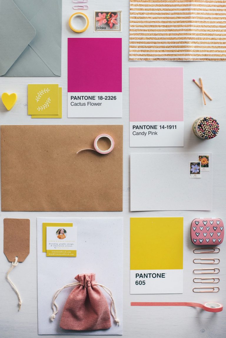
Contrast in your brand identity can be created with light and dark colours or opposites on the colour wheel, photography that uses shadow and light playfully, or contrasts in sizing of items like headings and body text. Kimberly now uses shadow and light contrast in her product photography for Swoon Worthy Scents:
“I noticed the photos by others I was always most drawn to be the ones that comfortably played with light and shadow. I decided to toss out the product photography rules I’d read about which said to only shoot in a softer light and began experimenting with shooting in bright direct sunlight, playing with the shadows it created. Once I started to do that, I realised how much more life my photographs had. Those feelings I was attempting to evoke became so much clearer and stronger in my product images.”
Another option is to choose contrasting words for how you want your brand to feel so that it’s rooted right down in the core of your brand. You don’t need to create contrast with everything you’re doing, just choose one or two areas you’d like to play with contrast and strive for harmony in other areas.
 STEP 4 / Bring it all together in a mood board
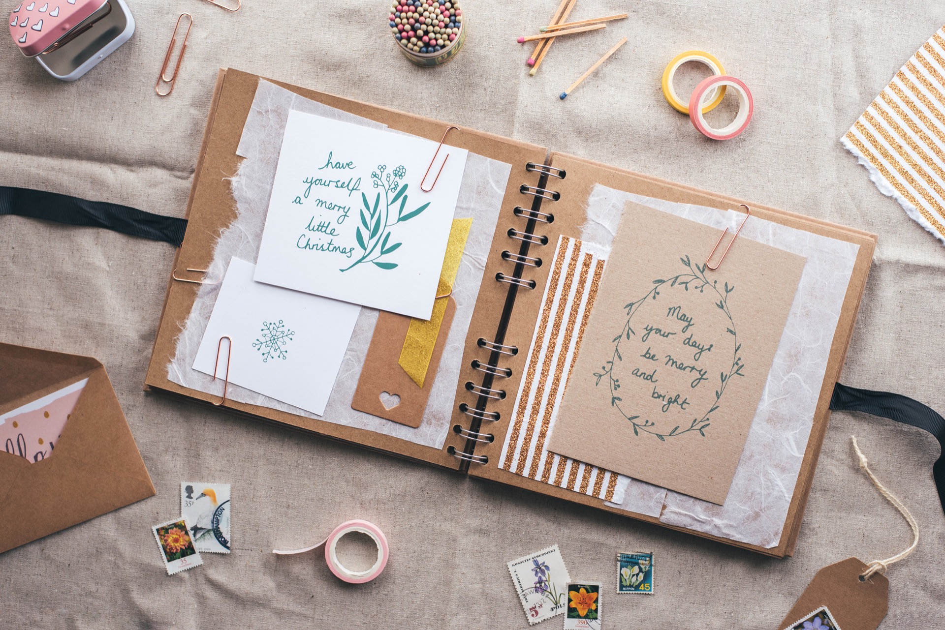
Now you have a handle on the first few secret weapons that can lead to beautifully evocative design, you need to bring your thoughts and ideas together into a mood board. Mood boards are really effective for guiding all of the visual aspects of your branding. Putting one together is brilliantly helpful whether you want to go on to hire a designer or design your branding yourself.
Take all of the things you’ve been thinking about so far and try to find images that represent the words, phrases, and ideas that have been sparked. You can do this with magazines and paper treasures you’ve kept, or you can do this online with a tool like Pinterest. Whatever feels right to you, do both if you wish! Like with your words and phrases, save anything and everything in the beginning, and then refine afterwards.
This is also where I would start to think about an ideal client or customer. But instead of agonising about what they will be drawn to visually, simply have someone in mind (it helps if you know them in person), put yourself in their shoes and run your mood board through their eyes. How would they feel about it?
Get inspired by them and see how you might tweak some of the things on your mood board. How might they decorate their home, what magazines do they read? Add new images to your board or refine what you already have. It’s a process and it can’t be rushed.
As you grow and become clearer on who your ideal client is after having worked with people, or sold work to customers you can go back through these steps and assess how things sit. Your brand is an evolving, living and breathing thing, so it’s a brilliant idea to keep all of this work you’ve done together somewhere and revisit it often.
Dive in and enjoy the creative process of discovering and developing your brand visual identity.
______________
Meg is a brand designer and illustrator at Lemon & Birch. She works with artists, makers, and service providers to channel their creative chaos into layered and meaningful brand identities so that they can stand out and tell their stories visually.
 STEP 1 / How does it feel?
 STEP 3 / Play with contrasts and differences
 STEP 4 / Bring it all together in a mood board