If you were inspired by the home of illustrator and Little Carousel owner Colleen Larmour, which features in our current issue, then you are in for a little treat. Today, Colleen shares some extra insight into how she has incorporated typography into her interior, something which has become less of a passing trend and more of a decor staple….
There is no denying the trend for typography in home interiors. What may have started with the iconic Keep Calm and Carry On poster popularity some fifteen years ago has now transcended into a love for all things emblazoned with written expressions, words, phrases and slogans. A love that is perpetuated in no small part to the growth and exposure written expressions have on social media today.
I have always loved written words and letters in all forms – stories, art and design, plus my husband is a graffiti writer – and when I look round our home, I realise we have incorporated typography into every room. There has always been this sense that no space is complete without words and letters on display somewhere. We all speak them, read them, write them every day, so to display them throughout our home has never felt contrived. Only natural and expected.
Photo: Jemma Watts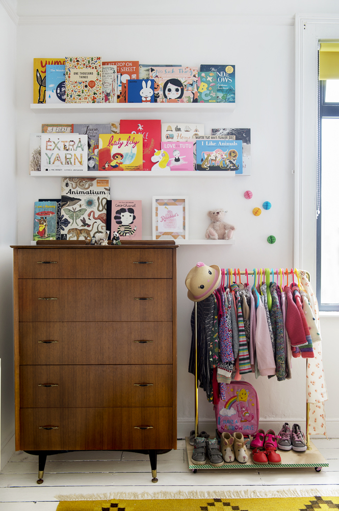
We dot many of our favourite books around the house, face out and proud. So many book covers are works of art in themselves and their presence is familiar and comforting. My heart lies with children’s books. Having written and illustrated my own picture books and collected an ever expanding stash of them over the years, exaggerated wildly since my two daughters came along, I relished the chance to display these upon a wall in their bedroom. It is a living display that constantly changes dependant on reading moods, new favourites, exciting discoveries and seasonal choices. The words, images and colours always on the move.
Photo: Jemma Watts 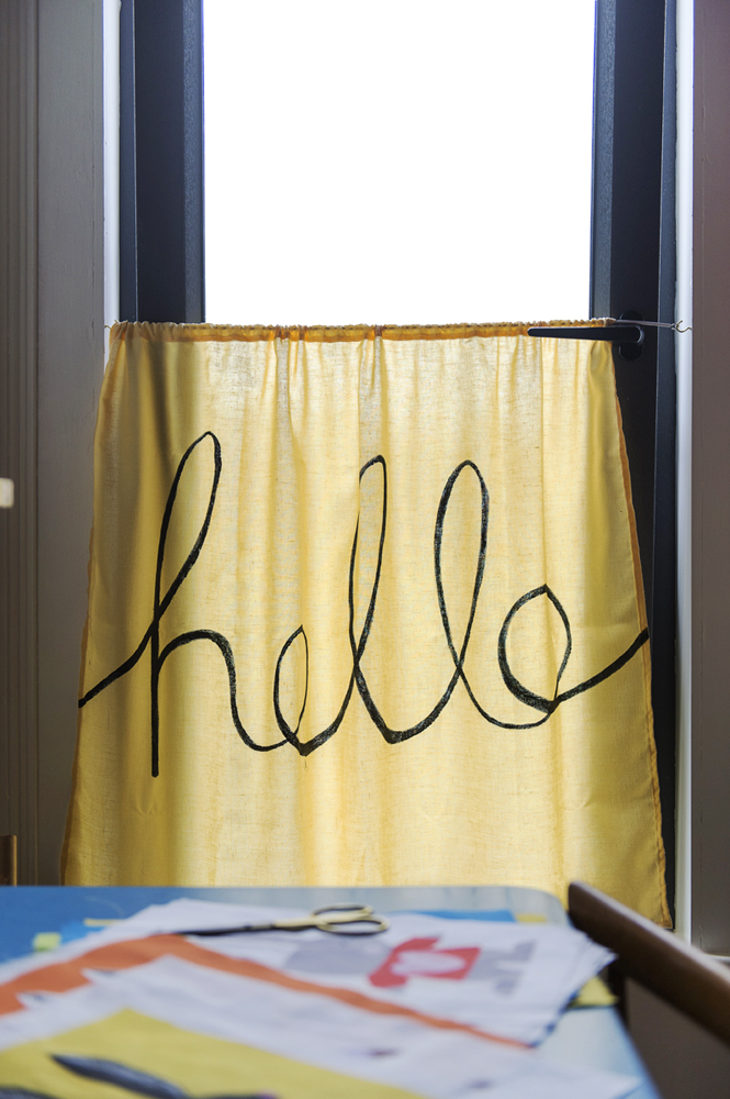
The yellow ‘hello’ curtain in my studio came about through necessity – I needed to create some privacy at night when working at my sewing desk. The warm pop of yellow can be seen from the other end of the landing, so it seemed appropriate to paint the cheery greeting on it – it makes me smile each time I walk past.
Photo: Colleen Larmour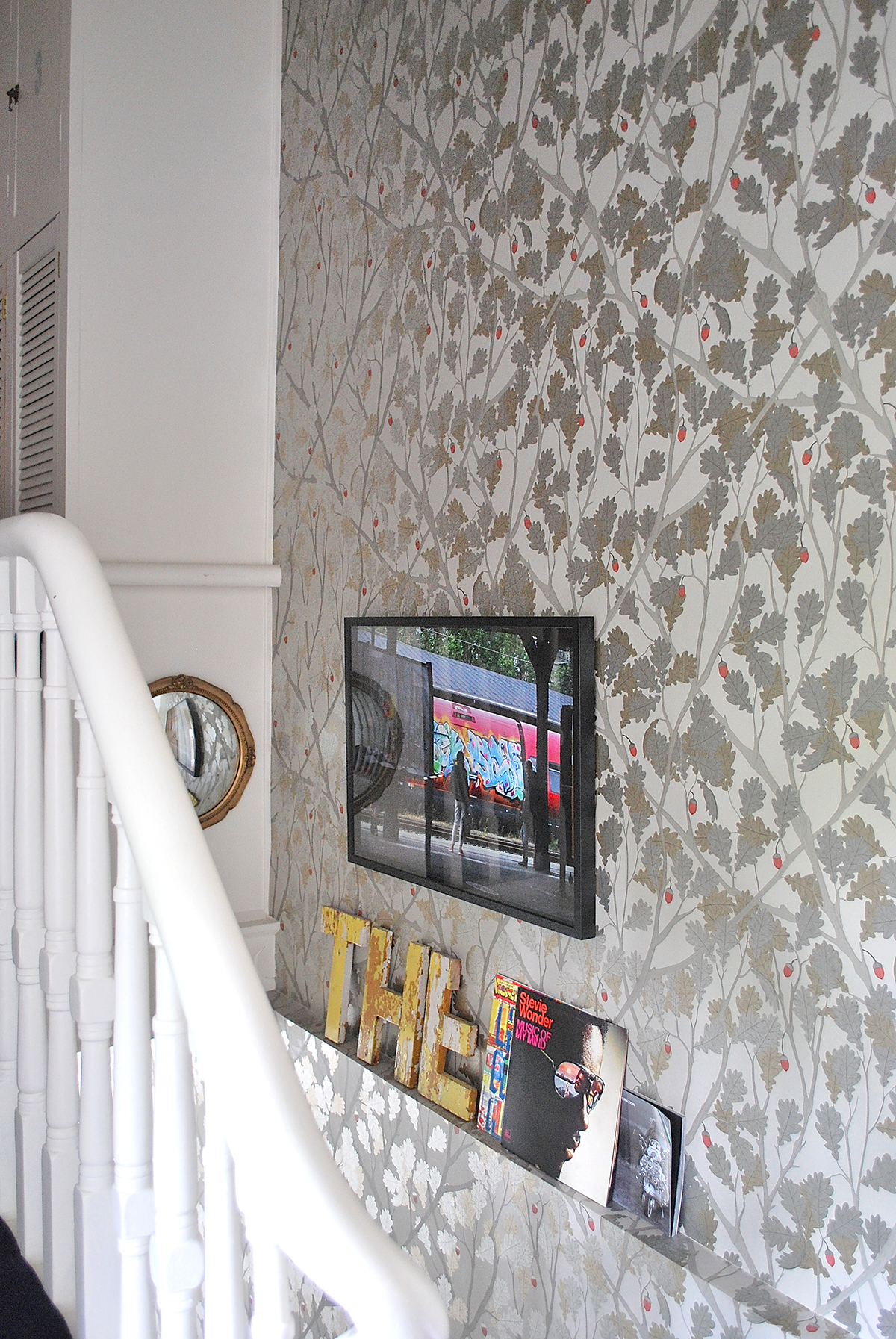
Something that always grabs the attention of people visiting our home are the yellow wooden letters that my husband salvaged on a painting job. Made up from part of an old sign from a Belfast building, Glenn brought them home and cleaned them up. The bulk of them sit beneath an enlarged photo of a favourite graffiti writer’s work on a train that he quickly caught on camera when we visited Copenhagen two years ago. A lucky shot!
Photos: Jemma Watts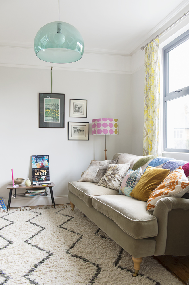
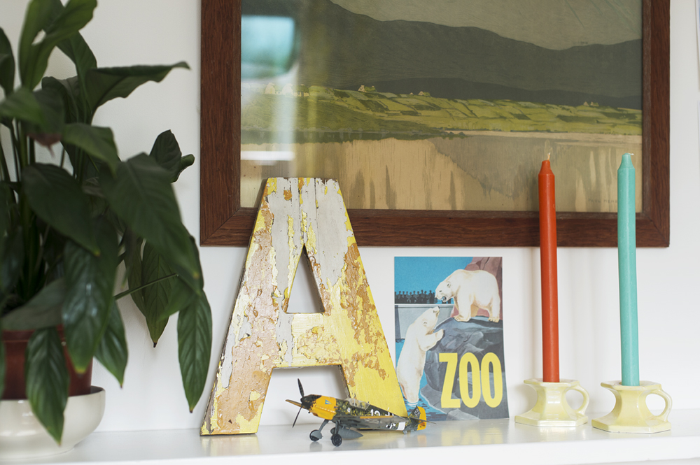
The letter ‘A’ rests above the living room fireplace alongside a postcard we picked up when we visited Amsterdam Zoo. I adore this little card for its combination of colour, image and text and the memories it gives me of a favourite holiday. Within the same room, we’ve displayed some of Glenn’s collection of graffiti books. Books and their covers, devoted to our love of letters.
Photo: Colleen Larmour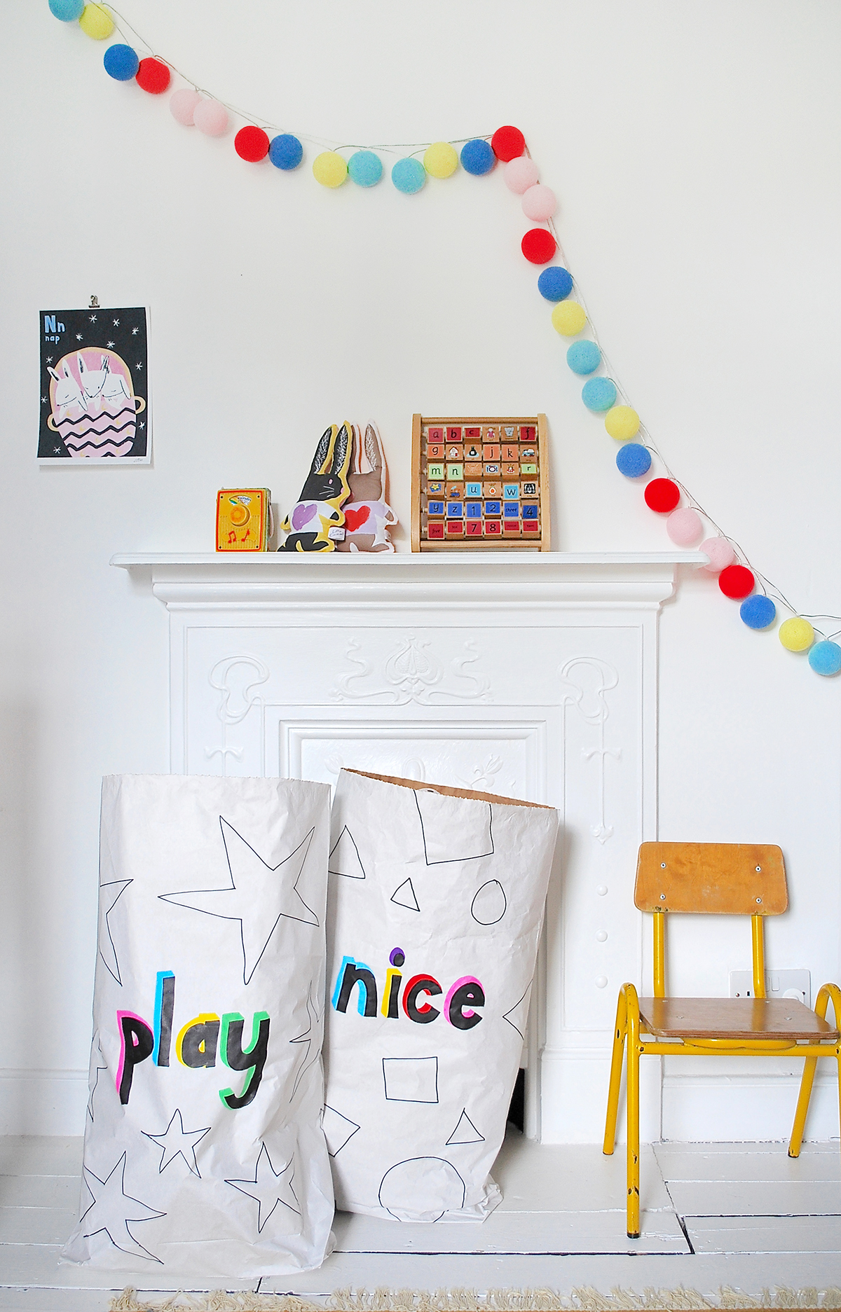
I had fun decorating the two paper toy sacks in the girls room with a tongue-in-cheek message about how to play together. Above these, hangs one of my own alphabet prints and a wooden alphabet toy.
Photo: Jemma Watts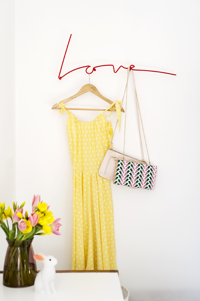
In our bedroom – our sanctuary – where so much time is spent switching off from the world and cuddling with our girls, hangs a beautifully designed coat rack that reads ‘Love’. It is simple, clean design at its best and gives an unused space in the room interest and zing.
Photo: Colleen Larmour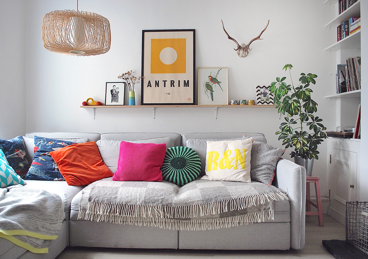
Photo: Jemma Watts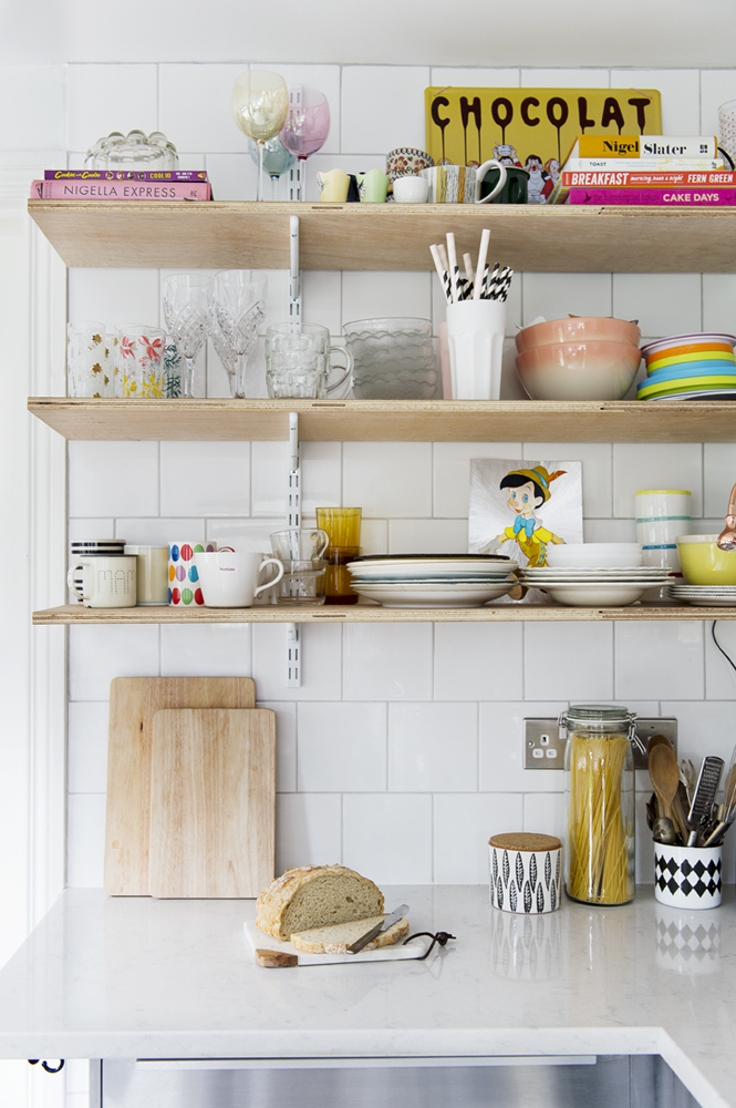
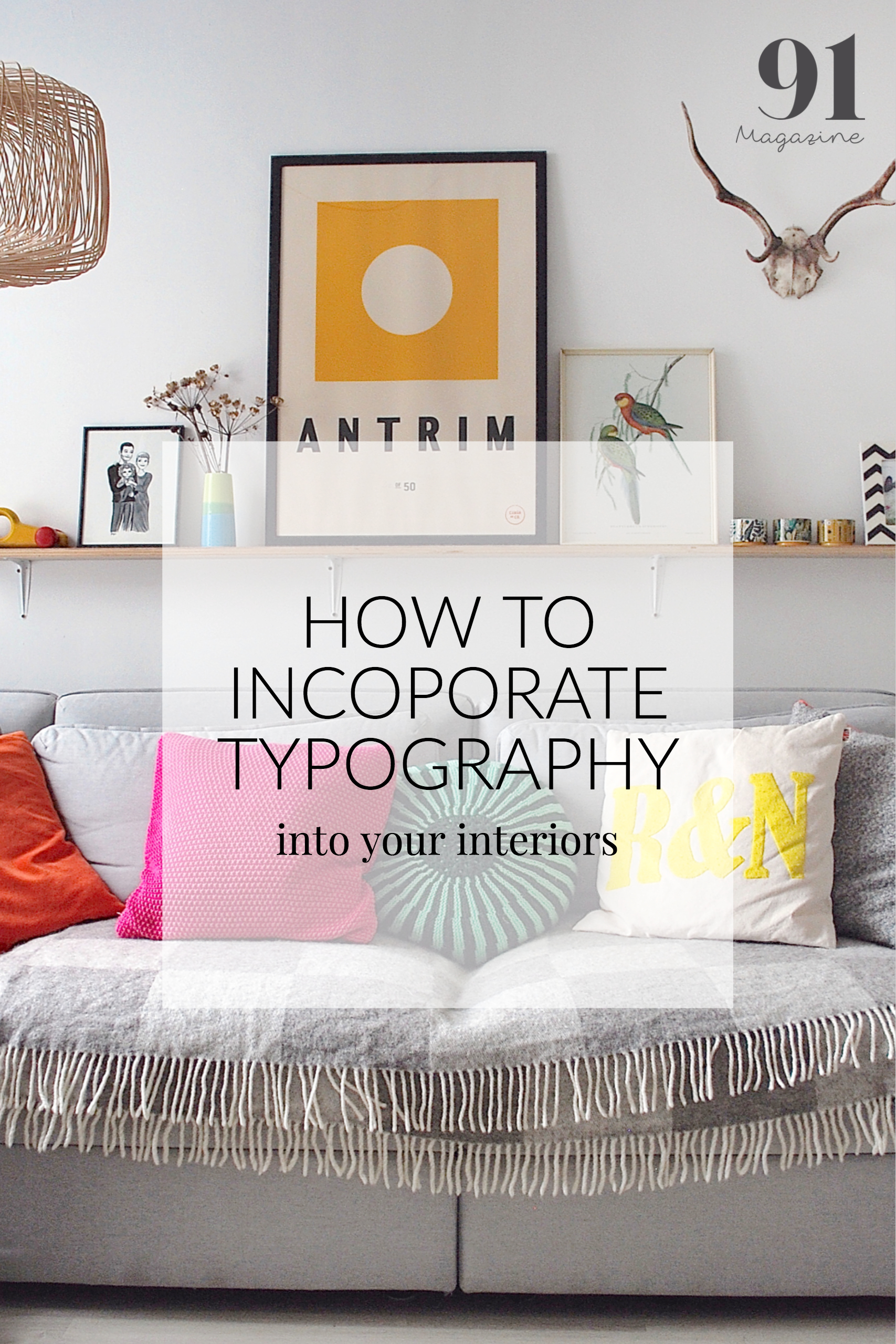
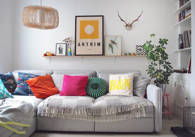
Back downstairs in our living space, typography, and our very apparent obsession with yellow, is again demonstrated via a large print of the county name we live in, plus a monogrammed cushion with my two daughters initials on it. In the kitchen, the tin ‘chocolat’ sign was bought on a holiday in France when I was pregnant for the first time and eating a tonne of the stuff!
Styled well in the home, typography can be beautiful and enchanting, even life-affirming and powerful. However, whichever way type is used, to really work there has to be some form of relevance and meaning to the individual. This meaning doesn’t have to be loud and explicit – sometimes subtle and quiet wins the day. I hope that is what we have achieved in our home – an authentic and seamless blend of words and letters, that if well read, tells our narrative, speaks of our passions and reflects who we are.
Thanks to Colleen for this inspiring commentary on her love for letters and words. We are off to rummage the vintage shops for signage and beautiful books! If you’d like to see more of Colleen’s home, make sure you bag yourself a copy of our SS17 issue, there aren’t many left folks! Plus, follow Colleen on Instagram and check out her kids toys and decor shop Little Carousel for colourful objects and prints for your little ones.
Photos by Jemma Watts and Colleen Larmour
